Infusing modernity and excitement into a brand without compromising its enduring warmth, love, and heritage.
Brand Development • Brand Positioning • Design • Merchandising • Social • Social Media Assets
Honey was entrusted with the task of rejuvenating the Hovis® brand, a staple in British households since 1886, renowned for its rich heritage in baking bread.
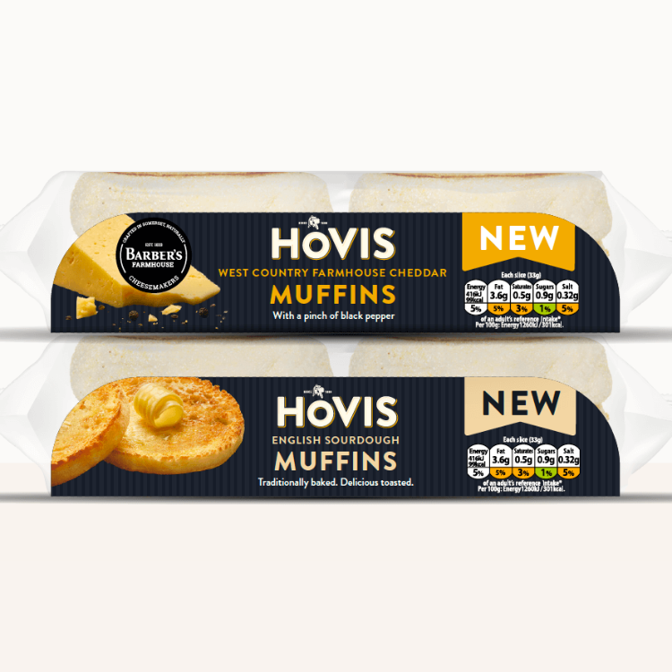
Their mission was to refresh the visual identity of Hovis®, including designs for both existing and new product lines, such as the brand’s inaugural venture outside of bread products into the realm of premium all-day brunch muffins.
The Challenge
The primary challenge lay in infusing modernity and excitement into the brand’s presentation without compromising its enduring warmth, love and heritage.
This task was particularly nuanced for the launch of the first non-bread product by Hovis®, demanding a design strategy that would ensure product distinction within its category, effectively communicate product benefits, and simultaneously resonate with the traditional values of the Hovis® brand.
Our approach
Hovis® Muffins
For Hovis®’s foray into brunch muffins, Honey developed designs that broke away from traditional bread-centric visuals. They introduced a contemporary flair by removing the logo from its usual loaf-shaped enclosure, opting for bold, dark colours and appetising product photography to elevate perceived quality and drive impulse purchases.


Hovis® Bake at Home
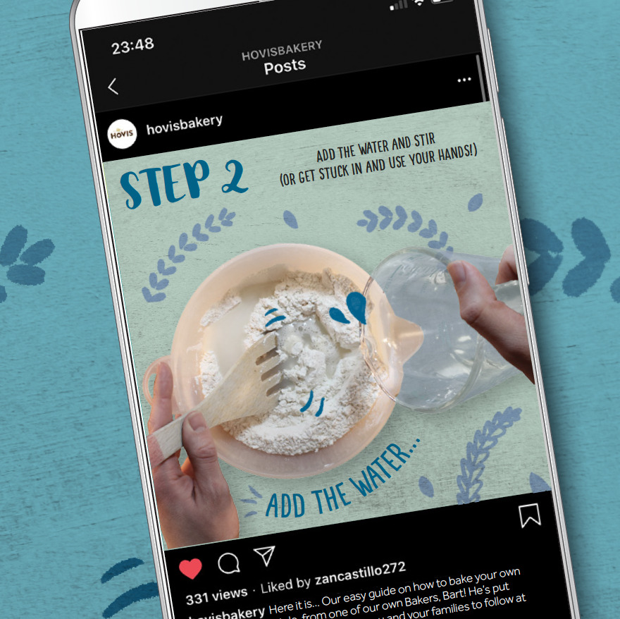
To inspire at-home baking, Honey crafted an animated guide shared on Hovis®’s social media platforms. This guide blended illustrations, photography, and textures into a playful collage, ensuring clarity and ease of following baking instructions.
Hovis® Nimble
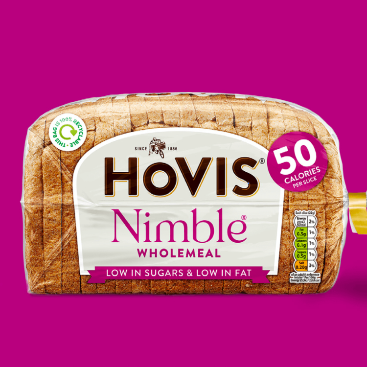
The Nimble® loaf packaging was revitalised to clarify information hierarchy while maintaining brand elements. By highlighting calorie content and aligning the logo with the broader range, Honey modernised the iconic Nimble® packaging and improved customer message navigation.


Hovis® Lower Carb
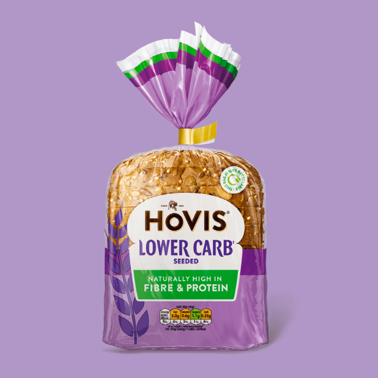
For the Lower Carb Seeded & Wholemeal loaves, Honey simplified the pack design to enhance shelf standout and product understanding. The redesign retained ties to the core range through the iconic logo, employing vibrant product colours and an enlarged ‘window’ for better visibility and freshness indication.
Results
The collaboration between Honey and Hovis® has significantly modernised the brand’s visual identity across various product lines, achieving a delicate balance between innovation and tradition. The refreshed designs have not only elevated the brand’s aesthetic appeal but have also facilitated clearer communication of product benefits, contributing to a positive reception among consumers and a strengthened market position for Hovis®.
Disciplines
- Brand Strategy
- Packaging Design
- Digital Marketing
- Visual Communication
- Social Media Strategy
Contact us
To learn how Honey and Pimento can elevate your brand through innovative design and strategic communication, reach out to us.
